Friday, October 31, 2014

Nature and the Compositions


Avoiding Mergers
Actually 2 Giraffes not1 with 2 heads
Background
a simple background doesn't distract from the subject
Balancing Elements
without the bench there would be empty space
Cropping
the photographer cropped the photo to get closer to the bird
Depth
There are lots of different stems which add depth
Framing
the trees frame the road in the image
Leading Lines
the dock is a long one which leads on to places
Symmetry and Pattern
the crop squares are symmetrical and in a patter
Viewpoint
this is an odd viewpoint because the boar is tiny
Rule of Thirds the bear is in the bottom right corner of a rule oft birds grid


Portait shoot plan

I hope I can shoot my friend Olivia because she is really pretty.  I would want to maybe take the photos  in a nature scene because she likes nature. To make this shoot successful i will make sure the IOS, Aperture, and shutter speed is all aligned with what the photo needs.  A possible place for this could be like next to a tree, or at a park.  I would want the shoot to be powerful, and i think it would look good if  the shoot is powerfully depressing or powerfully happy.  Both ways can look good. I think that i could use framing in this shoot. Like the tree branches surrounding the shot or something.

holography Self Portraits

I like this photo because he seems just really calm and collected and sort of depressed maybe. I like that its black and white and how the camera is showing so its probably in a mirror or something.  The black and white makes it more powerful. 

i do not know why but i am in love whit this portrait.  There is just great raw emotion that ads to the photo to make it funny.  His teeth make him look nerdy, as well as his hair and the camera lenses acting as his glasses. 

Casual Portraits

I liked these causal portraits because the couple look so relaxed and happy to be with each other.  The exposure and lighting is really good, and i like the scenery, especially in the second one. 

I also really liked this photo because of the framing composition that was done.  The sewage pipe (or whatever it is) frames the photo nicely and the woman has a nice smile.  She seems really reeled, which is great for this photo.

Environmental Portraits

I really liked this photo of a dancer because this is probably her life, and she just looks so dramatic and into the dance that it really adds to the photo.   I also liked how there was a mirror which made the picture more dynamic.

I also really liked this photo because of the colors. There was a great color contrast, like the cranberries and then the sky, and it made him look as if he was the only person on earth. I think that the red with the sky looks amazing. 

Self Portrait Tips copy and paste

Get Closer
The most common mistake made by photographers is that they are not physically close enough to their subjects. In some cases this means that the center of interest—the subject—is just a speck, too small to have any impact. Even when it is big enough to be decipherable, it usually carries little meaning. Viewers can sense when a subject is small because it was supposed to be and when it's small because the photographer was too shy to get close.

Experiment with Lighting

Another element of randomness that you can introduce to your portraits is the way that you light them. There are almost unlimited possibilities when it comes to using light in portraits.
Side-lighting can create mood, backlighting and silhouetting your subject to hide their features can be powerful.

Break the Rules of Composition

There are a lot of ‘rules’ out there when it comes to composition and I’ve always had a love hate relationship with them. My theory is that while they are useful to know and employ that they are also useful to know so you can purposely break them – as this can lead to eye catching results.
The Rule of Thirds is one that can be effective to break – placing your subject either dead centre can sometimes create a powerful image – or even creative placement with your subject right on the edge of a shot can sometimes create interesting images.

Monday, October 27, 2014

DSLR camera simulator

The aperture settings are from 2.8 to 22.
The shutter settings are from 1 second to1/4000 second.
The ISO settings are from 100 to 25600.

ISO

This is ISO 200


This is ISO 6400


1.  Because then you can get more noise in the photo and see sweat and the players' faces more clearly. 
                 2.  You should always use the lowest ISO when there is a lot of light. 
       
                 3. You should use a higher ISO when there isn't enough light. 

Shutter Speeds


This is an example of high shutter speed


This is an example of low shutter speed

At the beginning while the sun was still up and the courtyard had reasonable good light
a.) a booth in the middle of the yard near the Tree
b.) a food booth outside under one of the big red awnings
c.) the Stars performance inside the gym
d.) students dancing near the center of the courtyard
e.) people streaming in from the front doors
f.) the basketball booth where students are shooting basketballs at a hoop

a)low
b)low
c)high
d)high
e)low
f)high


                   Towards the end when there is no sun and has gotten dark enough that you can't see from one end of the courtyard to the other.
                                                                    …….same
You can set the camera to Shutter Priortiy, which is automatic.  You could do manual, where you set everything manually. or you cold let the camera select the shutter speed for you. 

Aperture

Aperture F22 

Aperture F2.8
We closely relate aperture to the pupil in the eye.
The smaller the aperture, the background is less clear, the bigger the aperture, the background is clearer.
Having a larger aperture will make the whole picture clear while the smaller aperture make the depth of field after the subject less clear.

Saturday, October 18, 2014

Abandoned Theme Parks

I would mostly want  to got and visit the abandoned Six Flags in New Orleans.  Its interesting because six flags is a very successful amusement park business, and New Orleans is a pretty entertaining city and the fact that the amusement park is abandoned and worn down is weird.  It's also pretty sad.  But i would want to take photos of the place to document the difference between a kept-up and abandoned amusement park from the same company


another 5 places that would be cool for photographers to visit would be:

a desert (like taking pictures of a single green plant in a vast empty desert)
a ghost town
night life in a foreign city
hamsters in cups
old people playing canasta
So someone already started this, but i think its so adorable I'm still recommending it :)


I would want to photograph this because there are os many different types of hamsters and their all cute.  They can make great photos.  I think that if you pair a hamster with the right type of cup, it can make a great photo. Like in the one above, its about the cutest thing ever.
It would be pretty easy to get photos of hamsters in cups.  You just need to find a cute hamster, and asks the owner if you could take a photo, and the cost though is pretty cheap. You might jet need to but the cup.  Also, you could just use a cana camera or something with a good zoom and focus setting.

Tuesday, October 14, 2014

Nick Brandt

My first reactions to these photos was astonishment because you could tell how close he was to those animal (especially the lions). When i read that he didn't want to pretend he felt a connection to the animals, i liked him a lot more because a lot of photographers say that they have these amazing connections to the animals, while some of them are telling the truth not all of them are.  I like that he's real. And another shocking feature of his photos was the contrast he was able to get between the animals and the sky, they were so clear. The benefits of being close to the subject, i guess :)
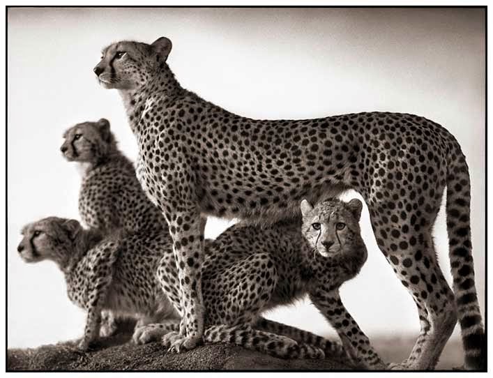
This is definitely my one of my favorite photos from Nick.  I love the cheetah's (or leopards, idk) faces.  The mother looks so passionate about whatever she's doing. and the little cubs are so cute, but formal.  I love their fur, and the contrast with the background.  The photographer used the composition of balance. 
Brandt  uses a medium format black and white film without zoom or telephoto lenses. His reasons for taking these photos are to show and photograph the destruction man has on animal life. He hopes that people will see these photos and understand that what they do influences (badly) animals, and will try harder to keep all the species alive. He focuses on the killing of animals for their parts, like elephants and their tusks."My images are unashamedly idyllic and romantic, a kind of enchanted Africa. They're my elegy to a world that is steadily, tragically vanishing." 

Thursday, October 9, 2014

Captions

I don't know if I have figured this out yet, because i forget things,  but maybe today will finally be the day i can actually get to the building where they give me my meds. The authorities made this because……. i forget.


BIlly Bob and I raced Josie over here because Josie is always goes a little crazy, if ya know what i mean, when she gets the first can of beer. It started when we were 25, and seventy years later, well, lets just say she still needs  us to watch her. 

I was trying to get Hank to take the picture so i could get in, but his pants accidentally fell down, and he was wearing a speedo. They took offense….

Tuesday, October 7, 2014

Photo Mural Project Ideas

1.  I think a really good theme for this idea would be to take a bunch of photos surrounding "happy" and pep rally days.  Thats when people dress up, get their faces painted, which can make great photos.
2. Open it up to cameras too because some of us can't bring our phones to school, or just dent have a smartphone.
3. We should put the panels where everyone can see them.  Like in the courtyard, or in the gym, cafe, or a popular hallways, above the library maybe.

Great Black and White Photographers part 3


1. I wanted to chose a photo by Robert Doisneau because in the photo i did end up using, the emotion on the musicians face is great.  I also like how he is sitting on the ground forlornly with instrument and people are carrying on with their lives behind them.  The black and white affect added to the solitary of the photo.      
I see the people walking around the man like he doesn't even exist. 

I smell the cigar smoke of the man that just walked on by.
I hear the sound of the beautiful sadness of the music the man is producing.
I taste the body sweat of everyone in the street moving fast
I feel as if his feelings go deeper than the way it seems


I really like the photo from Eugene Atget because….. i don't even know why.  Its just the whole composition and subject of the photo that draws me to it.  The man is looking at the camera and frowning, so he's probably not very happy about what he's doing, but this just makes the photo that more intriguing. 


  I love this photo. The thing that drew me to it was how clear the man's face is and you can see the sweat as he's drinking the water.  I also wanted to chose this photo because i wanted to honor the the people that fight for our country.

I see the battlefield of men preparing for fight
I smell the sweat mixed with gunpowder filling the air
 I hear the anguished cries of men reading letters from home 
I taste the bittersweetness of hatred  
I feel as if this man will risk his life for us

I would want to make posters, books, blogs, just about one of these photographers so everyone will be able to see and know about this photographer. 


Friday, October 3, 2014

Academic Shoot Reflection and Critique

1. Some challenges that I endured was trying to vary my photo subjects.  i didn't want all of my photos to be of a kid in a classroom.  I wanted to have different pictures.
2. I though the most about the focusing of the camera.  this is also my favorite part for some reason.  I like seeing the difference between a blurry and focused photo.
3.  Now i would probably try to do better angles.
4. I would still do the same areas and subjects .
5. I think that the framing is the easiest of all the compositions.
6.  Probably the hardest composition is simplicity for me because there is always some sort of busy background and its hard to find a subject without a busy background.
7.  I'm still not really sure on avoiding mergers, but practice makes perfect so i'll just keep practicing.
i commented on this person
http://brianmjblog.blogspot.com/2014/10/academic-shoot-and-reflection-brian.html?showComment=1412700614600#c6292934326648155582

Academic Shoot

Simplicity
I chose this photo for simplicity because the background is blurry so it makes your eyes focus on the object in the front, which is clear.  The background isn't that busy, and the blurriness takes away most of the business, so your main view is the faucet.  The subject is the faucet in the science room.  On first glance, its hard to know what the subject is because it doesn't look like a normal faucet.   Maybe for my simplicity photo i could have done a less busier background. 

Rule of Thirds
I had a lot of fun taking this photo :) and it was accidental.  So i was leaning up against a wall, and then this fly came at me it landed on this sheet of paper that was on the door.  I slapped it and killed it :( but i found it ironic that this sheet of paper has the word "flick" on it and a dead fly. This applies to the rule of thirds because the fly is in the lower left hand side, which makes it look better because then you can see the names and other academic words.   The subject is obviously the fly. 

Framing
I chose this photo for framing because i took this photo through a door window into a book room and the door edges are the framing.  I like how the lines are clear and the books and shelves in the room is blurry.  There really isn't a subject in this photo and i think it was a good example of framing.
Lines
I chose this photo for lines because i really like how the lines of the shelves lead off the picture and make you wonder. I also like how the we can read the first label, which makes it academics.  I think making it black and white was a good idea because it makes it more simple but prettier i think.  The subject is the shelves, and thats pretty obvious.

Balance
This was also a fun picture to take because while i was in the room  the kids were trying to not look at the camera and it was hard for them to actually act normal, but they tried.  I chose this photo for balance because kids and desks are taking up the whole framing. The several different heads create balance.  The subjects are probably all the kids, especial John and Jackson.